Thursday, February 24, 2011

Multiplayer, The World Map, Regions, and Windstorms

This week there is less to visually show you for A Valley Without Wind, but it's been a hugely productive week nonetheless.  An updated screenshot gallery is now on the main AVWW page.  And here's the latest video:


Multiplayer
Perhaps the most exciting thing in progress at the moment is multiplayer.  It's been almost two years since I wrote my case for co-op games, but everything in that post still holds true -- and we're really excited to be bringing multiplayer to AVWW.  It's mainly a co-op game, as a lot about the stats and world is collectivized rather than for individual players, but there's room for pvp content if the server administrator wants to allow it.

That's right -- an Arcen title with servers, rather than peer-to-peer connectivity.  Unlike RTS or puzzle games where peer to peer gaming is the norm, AVWW follows a model more like an FPS game or similar.  You can launch the game server on any computer, and then other players can connect to it (including the computer running the server, if you wish).

We're not going to be putting any explicit limits on the number of players per server, but we're not sure it will do well with more than 16 players -- we'll see, and obviously it will depend on the hardware and connections in question.

Right now it is still super early for the networking in this game, and this game uses a new style of networking for us (the action-game-style "diffs-only" model, rather than the RTS-style "fully-synchronous" model that we have always been accustomed to).  Using a whole new networking model is likely to lead to a whole new set of problems than we're used to, and so until recently we'd been wondering if we could really accomplish networked multiplayer at all with this title.  It's still early yet, but it's looking promising and at this point we're pretty much committed -- we just can't imagine this game without multiplayer at least being an option.

Keith has been absolutely invaluable for this part of the project, taking over the networking for the time being since I simply don't have the time or the mental energy for it at the moment (between juggling the art and the parts of the programming I'm working on, that taps me out for now).  This style of networking has been the only big "can we really do this?" component of this project for us, and so we're really happy to be tackling this now and finally putting that question to bed.  So far it's still very early, as I noted, but it's looking quite promising.

I expect we'll find all manner of multiplayer-specific issues in alpha with the help of all the players with various configurations and setups, but it should be orders of magnitude less pain and trouble than what Minecraft has been going through to get them from alpha to beta -- that's another reason why we're hitting the networking sooner than later.  Fingers crossed.

World Map
The other big new thing this week, and this one does have a visual component, is the world map.  Each tile on the map is a "region," and consists of one big outdoors area with a variety of buildings, caves, tunnels, and so on leading down into the earth or up into the sky.

Each one of these areas where you can walk around contiguously is what we call a "chunk," and up until now we've just been working with a single outdoor chunk at a time.  That's been great for early testing purposes, but it's not representative at all of how the real game is to be structured.  Now we're finally getting that overarching structure into place.

Right now the movement on the world map isn't smooth, as you may notice from the video above, but that's just something we haven't gotten to yet.  The functionality and visual style is pretty much all there, though -- the world is set up like a set of Carcassonne pieces, laid out in a rounded grid-like pattern.

Regions
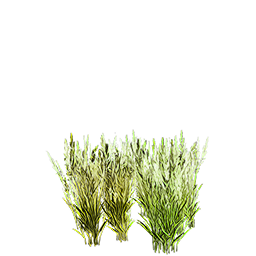
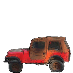
All the tiles on the world map are called individual regions, and get populated as such.  There will be many, many types of regions in the game as we move toward version 1.0 of the game, and I'm hoping to have even around 20+ in place by the start of alpha.  At the moment we have 7: Grasslands, Grasslands With Tree Clumps, Ice Age Snowy Plains, Ice Age Snowy Woods, Ice Age Thawing Plains, Ice Age Thawing Woods, and Junkyard Crates.

In turn, all of the regions are organized into super-regions, which span multiple tiles and create the realistic/interesting distributions that you see in game.  Some super-regions are more rare than others (some are very rare), and individual regions have a rarity within their parent super-regions.  Right now there are 4 different regions in the game: Grassland, Ice Age General, Ice Age Thawing, and Junkyard.

My goal for alpha is to add another 4-6 regions, but we'll see how things go and how much time I have between now and alpha.  This week a lot of my time was spent designing these regions, doing art for them, and doing a lot of code related to getting regions set up the way that I wanted.

The best thing about each individual region is that it can be populated in so many different ways -- regions are just the most coarse descriptions of what an area will be like, but there are thousands of possible types of grasslands, for instance.  And that complexity is only going to grow even further as my content generation work continues.

Windstorms
On the world map, you move between pieces an entire piece a time (rather than smoothly), and each time you do it counts down on a "movement counter" in the upper right corner.  Right now that's set to a really high number for testing purposes, but in-game that number is expected to start at 4.  Every time you hit 0, a "windstorm event" happens, and the counter resets to 4.

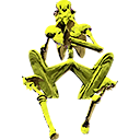
These windstorm events suck you into the region you're standing on, and involve a huge amount of blowing wind -- and possible rain/snow/sand as appropriate -- along with monsters that are all super-powered and extra prevalent until all characters have escaped from that region.  This makes travel difficult,  particularly in parts of the world map with levels higher than yours (region levels aren't in place yet, but are something I've talked about on our forum for AVWW).

But, there's a catch -- if you've constructed a wind shelter on a region, you'll see a little wind shelter icon on that region's tile on the map.  If you're standing on a region with a wind shelter when your counter hits 0, then nothing bad happens to you at all, and the counter just resets to 4 instantly.  In this way you can "colonize" the world in yet another way other than the settlements that we've talked about in past interviews and on the forums.  When you have a network of wind shelters, you can move around relatively freely -- when you stray into new territory, the risks go up.

Other New Stuff
I've put in place about a dozen completely-new trees and plants that you can see in the screenshots and video, as well as another dozen variants of past plants (mostly snow versions for the new snowy ice age areas).  This nearly quadruples the total number of types of trees and bushes in the game.  I also more than doubled the number of buildings in the game.  You can see how the various buildings are now taking on region-specific looks, something which will be emphasized even more in the future.

Keith got a number of "chunk script" features added in, as well as making it possible for buildings to have literal doors that take you inside.  The code on that isn't 100% finished yet, but it's getting there, and the art for interior stuff isn't something I've started on yet.  Hopefully interiors can be my big new thing for next week, but we'll see how things go -- we also have more enemies, more regions, more spells, and a lot of other content-related stuff that we want to get done in the next 2-3 weeks.

Pablo's been working on some of the first sound effects this week, and has been figuring out a general sound style of the audio work in the game.  I'm really pleased with how that's been coming along, but we probably won't highlight that in videos for a while yet, until we've got more of the sounds all in place together.  I'm really pleased with how the sound design is coming along, though, and I think it will be Arcen's strongest showing yet in that department.  Pablo also managed to find time to create a new World Map theme this week, despite all the work on sound effects.

Until Next Week!
All in all... it's really coming along.  For five weeks in, this is content-rich already.  The regions still feel way too empty, but my main personal goal between now and alpha is going to be filling it in and making it feel more and more like a unique world, while Keith works on crafting, NPCs, and such.

Multiplayer has been a bit of a scope increase for us, and might set us back a couple of weeks.  I think we're looking at the last week in March as the absolute earliest time for the first alpha version, but it might be into sometime in April, we'll see.  We've got a lot of press wanting to do previews as soon as the first alpha comes out, and we've got a lot of players waiting to preorder and start playing at the time, so we want to make sure that we have something slam-dunk exciting from day one, even if it is a tiny subset of what we're planning for 1.0.

We'll keep you up to date on the schedule as things progress, of course.  Right now the big question mark is multiplayer networking, and how long that takes us to nail down.  If that's finished by the next video, then we're actually going to wind up a half a week ahead of our self-set schedule.  If it takes longer... that's when we'll have to adjust.  But it shouldn't delay us more than a few weeks at most, from what we're seeing so far.

More to come next week -- stay tuned!

Friday, February 18, 2011

Shadows, Traps, and Particles, Oh My!

It's been a productive week!  The difference in the feel of the game between last week and this week is pretty astronomically huge, which is awesome because I spent at least half my time on non-AVWW business stuff this week.  That means future weeks will go even faster -- but I digress.

Here's the new video:


And here's what is new:

Art Progress: Shadows!
Last week we showed off some of the first buildings, and the first basic particle effects, as well as redoing how all the plants were blended into the scene.  That seemed to really make people happy compared to two weeks ago, but there were still a lot of comments that folks wanted to see shadows in the game.  I'd been reluctant, because I figured there was no way shadows would look right in a game of this sort.

I have never been happier to have been massively wrong.  This week we now have shadows in place, and they are utterly transformative.  The buildings and plants from last week are all unchanged, but with the addition of shadows they now seem so much more grounded in the scene.  And the terrain seems so much more alive at the same time, too.  The exterior art style for the game is now feeling very close to final in these versions.  Granted, I need to do art for a ton of more terrains, buildings, objects... you name it.  But they will all be done in this style.

Skelebots
Keith, meanwhile, has been hard at work this entire week on gameplay and the HUD and menus.  Characters and enemies now have stats and levels, and gain experience points from killing things.  The robots have been renamed to Skelebots, by the way, since they look partly like skeletons.  Humorously, some of the skelebots started cannibalizing each other as they chase the player, and thus gain experience and eventually combine into one Super Skelebot that is very hard to kill if you let them chase you long enough.

This is because the enemies are now much better at pathing, and both the players and the enemies will slide around obstacles rather than getting stuck on them.  And in terms of the skelebots in particlar, they will knock down weaker obstacles (trees, cars, etc) as they home in on you.  The effect of this can be quite terrifying, as when there are thick  trees you might not even see the skelebot, but you see this cloud of dust being kicked up as trees are snapped in a line heading straight for you.

Luring enemies into open ground is a definite strategy, although keeping things to close quarters can still work, too. Last week we had barely gotten this first enemy in place, and so it was getting stuck on obstacles all over the place and generally being ineffective.  They looked scary, but were ridiculously easy to evade.  This week... they're unsettling, to say the least.

HUD
The on-screen HUD for the game is intended to be very minimal, as with many action-adventure games, to let you see the most of the action as possible.  There are six skill slots along the bottom of the screen, and you can switch between three different sets of these slots with the press of another button.  The text to the left of these slots, showing the level and experience points, is very temporary and still in the AI War font.  But that's about the extent of the HUD.

Spell Targeting
One thing that the PC folks complained about last week from the video was that combat was basically only on the four main compass directions.  This is pretty familiar to console gamers, and so I hadn't thought much about it (being a pretty even mix of lifelong console and PC gamer).

Keith was experimenting around last Sunday, though, and put in a targeting system where you can press tab to cycle through enemies -- and that turned out to be just what the doctor ordered.  That let us increase the speed of the skelebots, for one thing, so that they run only a hair slower than you.  Before that would have been instantly fatal, but now you can lob fireballs or other spells over your shoulder as you run.  That really changes things up.

There are actually two different fireball spells now, you might notice from the screenshots or video.  One is just a dumbfire mode that either aims along a compass direction or straight at an enemy you've targeted.  It doesn't change course once it's been fired.  The second is a homing fireball, which curves to seek the specific target you've selected, following them as they move.  The homing fireball really only works in open spaces, but it can be shot in a dumbfire mode along the compass directions as a backup, too.

Inventory and Scrap
The first bits of the inventory have now been implemented, although we still have some visual and code work to do with it.  This is pretty exciting, because a ton of parts of the game revolve around picking up items and loot and later crafting or trading with them.  Also, all of the spells and other actions you can take aside from moving around are based on items that you equip into slots.

Last week we just had a couple of spells hardcoded into place for early prototyping, but this week they are fully spell gems that are equipped and which can be shifted around.  In this week's video, you can also see that the enemies and other destroyed objects are dropping little glowing balls.  Those are the earliest versions of scrap being dropped, such as various types of wood, metal, etc.  These are useful as minor components in crafting -- more on that later.  Suffice it to say, this is coming along quite well.

Traps
Bear traps have been added to the game as the first trap.  These are used just like spells, but are deployed directly in front of you.  This makes it almost impossible to deploy traps while enemies are actively chasing you, since you can't run backwards.

The effective trapper sets up his/her traps in advance, and then lures the enemy across them.  Traps are one of the five main classes of craftable items (along with weapons, armor, magic gems, and consumables), so there will be lots more to come from them.

Particle Effects
Last week we had a very basic particle system, and some particle effects that looked okay.  However, this week we now have the final versions of the fireball and heal spell effects in place, along with the teleport and summon tree effects.  Plus lots more types of death explosions, which look pretty cool. When you die, there's a big red poof.

This was my big project for about half my AVWW time this week, and I'm really glad to have it in place now.  Not only did this involve a lot more particle animations in Particle Illusion, it involved a lot more programming of possible particle behaviors in the game itself.  Fades, movements, delays, scaling, shader selection, and other things.

There's still more that we can do in the future, but the particle scripting system in the game is pretty darn robust at this point, and lets us get some pretty complex effects.  What you see actually implemented so far is just the tip of the iceberg, but will give you a pretty good idea of what's coming.

New Objects And New Junkyard Scene
There are a variety of new objects in the game this week, although not as many as last week since we were mostly focused elsewhere.  A couple of new kinds of grass and reeds for the junkyard type scenes, new shipping containers also used there, and tire piles as well.  All of these objects (not the plats) are destructible by players and enemies.

The randomized junkyard scene is mostly for testing and example at this stage, but it adds some more variety to our green cliffs and snowy woods scenes that you've seen before.  These are using the "chunk scripts" that will later be the underpinning of the procedural generation methods for the game, but right now they're only so random.

Story Evolution
Over there on the official AVWW page (where you can see all the new screenshots, too, by the way), the "What Is A Valley Without Wind?" section has been updated to include one new paragraph at the end.  The story about this being a post-ice-age survival game is still true... to a point.

The receding ice age has been the whole of the characters' existence up until the start of the game, but as the game gets underway the scope of that story actually expands to contain something much larger.  No spoilers!  But for those who are wondering: no, it isn't time travel.  I do love a good time travel story, but this is something more original, at least in the world of game stories.


Coming Soon
A big goal of ours coming up is to get the world map going, and actually cross-chunk movement and the more official regional seeding scripts.  That's when we'll start seeing more unique and interesting regions, and where all those tons of new art pieces are going to be coming in handy.  That, plus building interiors, caves, etc.

I can't believe we've only been working on implementing this project for four weeks -- with all the months of design talk, it feels like longer, but we're also just so much further along than I would have expected for this sort time period.  That's... unusual for us.  We're still looking good for the first public alpha hopefully in late March, but of course we'll keep you up to date over the coming weeks as development continues.

As each subsystem comes online (art, HUD, particles, actors, world map, etc), that's taking us ever closer to the point where we can really let loose and focus hugely on content and gameplay almost exclusively.  That's exciting, because even for the first alpha I want to have a huge amount of variety.  So far that's looking quite feasible!

Thursday, February 10, 2011

Massive Content Generation Techniques In A Valley Without Wind

So!  It's been less than a week, and a lot has changed.  I'll start by showing the latest footage of the game:


The reaction to last week's video and screens was mostly positive, particularly when folks saw shots reflecting the actual in-game resolution, but there were common concerns about the buildings, the character's running animation, the white borders around some graphics, etc. Well, all those have changed drastically this week, as you can see in the video above.  There are also a whole new batch of screenshots on the AVWW page, replacing the old ones. 

The screenshots have a very slight bit of JPEG distortion -- they look crisper in-game -- but it's very near what you'd see. 

Plants, Ground, Sky, Etc
As you can see from the video, the game looks its very best in motion, with all the plants moving around, clouds moving, and so on and so forth -- you really get a sense of being outdoors in the wild woods and fields like what I grew up hiking through in North Carolina. That's not something I've seen represented in any other game I've played, so that's exciting to me.

In terms of these aspects, the game is probably about finalized on its style, which I'm excited about.  Now it's time to really crank out more content and more variety for the plants, to give variety.  Right now it looks cool, but there's only about 8 different trees and maybe 12 kinds of smaller grasses and bushes, so there's a limit to how many different scenes we can do. 

By alpha, I hope to quadruple those numbers at the very minimum, and ideally it will be even more than that.  A lot of the planets will of course be somewhat special-case-y: desert scenes, fully snowbound scenes, etc.  But hopefully at least 2/3 of them will be versatile enough to be combined and reused in all sorts of different and interesting ways to provide lots of interesting compound effects.  So far so good.

Buildings
The way that we're going about creating buildings is really different from what I'd previously thought we would do.  I experimented with many different things, but at the high resolution and level of painterly realism that we're supporting, it's just not possible to do buildings piecemeal, built up from smaller component parts that are fully interchangeable.

That's a hallmark of building interiors, of course -- everything from Diablo to Demon Stalkers on up all use that technique for interiors, and we definitely will be, too.  Being able to have customer, user-definable, quasi-dynamic floorplans is a key feature of this game. 

I'd hoped that I'd be able to do the exteriors with a similar level of flexibility, as I had previously done with Alden Ridge back in 2008, but moving from 28px tiles to 64px tiles and going from a retro pixelart look to a unique painterly look has included a lot of adjustments for me for creating believable exteriors.  Since that was to be the greatest artistic challenge for the game, that was my first focus -- no sense putting off the hard stuff.

When it comes to buildings, therefore, what I've settled on is doing each building more or less from whole cloth -- it's a unified image that can't really be tiled or combined in most cases.  This allows for the awesome painterly HD look you see there, but it comes with a loss of flexibility in the art for building exteriors.  That's okay, in the end, because it's just eye candy rather than functional, anyway.  And I'd rather have less art that looks really good, rather than a ton of art that looks like the office building did last week (that was never more than a super early prototype, by the way).

This in turn adds a really immense load to the artwork, however.  I've been doing building modeling for my art for years, but doing just a single model even at fairly low resolution can take me 1-4 hours depending on the type of model.  There's just no way that I'd be able to meet my goal of having hundreds of different buildings if I tried to build every last component myself from scratch, as fun as that is.

The solution?  I'm now using purchased 3D models for a lot of the detail stuff.  These are not custom-built for this game, which means that they come very inexpensively.  But the end result is very unique, because by the time I've scaled, positioned, lit, (often) re-textured, (sometimes) chopped up and rearranged, (occasionally) animated, and (always) heavily postprocessed each building, I get a really unique look that fits for this specific game and this game alone.  That cuts my time per building down to between around ten to sixty minutes per building, which is a massive improvement.  And it lets me get a really awesome result like you see here, without spending much or delaying or derailing the project.

Characters
I had hoped to do a second playable character for this week, but all I wound up with was the new robot (an enemy that looks kind of like a nightmare C3PO), and fixing the first character's animation.  That required just rendering another 5 frames per side in Poser, and then I also improved the saturation and vibrancy of him, too. 

In terms of the robot, I also did him in Poser, and gave him his freaky skittering walk in that program directly, too -- I didn't know I'd be able to get such an unusual movement style in Poser, I thought I'd have to resort to Mudbox for that in more cases than apparently I'm going to.  So that's pretty cool!  I used Poser 4 a lot back in the day, but Poser Pro 2010 is new to me and the UI is a bit daunting.  I'm getting way faster with the characters, though, which is a good thing -- hopefully next week I'll have even more to show in that category.

Spells And Particle Effects
So we have our first two spells in the game now -- thanks to Keith!  While I've been working on the art and a little bit of programming, Keith has been really going at the code.  This week is the first week where this game is actually a game in a literal sense, in that you can do more than walk around in the woods.  That alone is pretty cool. :)

Particle systems are something we've done a bit with in AI War, and more with in Tidalis.  However, because of the scale of the former, and the genre of the latter, we only did so much.  Well, with AVWW, that all changes -- this game is going to be whiz-bang fancy with the particle effects, and in the last couple of days we've taken the first few steps on that road. 

Particle Illusion is my go-to for rendering individual particles (animated or still), and then we're using procedural animation techniques in-game to create more interesting and dynamic compound effects.  This is all stuff we've done in our other games, but here we're just going to be having a lot more particles and a lot more complex effects.  Given the genre at hand here, and the closeness of the zoom, that's something we can really do to our hearts' content, unlike in the middle of a massive space battle or a puzzle game where the player is trying to concentrate.

Character Animations?
Here's a secret: one of the reasons that particle effects are so important to us for this game is that they will let us have a spectacular high-res display that dazzles and is fun, but without doing much in the way of character or minor monster animations.

As I noted above, our work with the particle effects is just beginning -- those are going to be a lot more prominent with spells, but also with even things like melee effects. It's a trick a lot of Anime TV shows use to save on animation time, and it's something we can put to use for ourselves, too, we decided. Funnily enough, the result actually looks better in a lot of cases thanks to the flashy effects.

In return, this lets us have a vastly greater diversity of playable characters. This is important for a game like this, in which any NPC can be a fully-playable character. In your average RPG, you have maybe 6 to -- at absolutely most -- 12 player characters to animate. In your average adventure game, in the Japanese flavor anyway, you have usually one. Then all those NPCs that you meet are just having very small animations for standing, walking around, and maybe talking if it's a AAA budgeted game.

That sort of concentration of animations just wouldn't work here, though -- all of our NPCs have to have just as many animations as a player character, because they are all player characters.  That could quickly get ridiculous in terms of the production time, and would make adding more characters prohibitively expensive to do.  Since I don't want to have a massive adventure game with only four or five characters running around, that's a big problem, no?  How is an indie to solve this problem?

Particle effects is what we settled on, drawing inspiration from the likes of Dragon Ball Z on television.  All those cool particle effects?  Well, they draw the eye for one thing, and for another they actually obscure the world a bit, too.  In Tidalis or AI War that was a bad thing -- you have to see to play.  Actually, that's true here, too -- you have to see the field and what you're doing. 

However, what you don't need to see, at the instant the spell is cast or the melee attack is launched, is your character.  In a brief poof of particles, your character takes some action that is clearly conveyed on screen without being directly shown. 

Thus we can get away with rendering "only" 39 frames and 1 portrait for each NPC, and a similar amount for most of the smaller monsters, instead of 10x or 12x that for having swiping/hit/grab/open/etc animations that you'd normally have.  And you know what?  This is critical, because even with just those 39 frames, the Darrell character is half a megabyte on disk, and the robot is about 750 kilobytes. 

If we have sixty plus characters, as I'd ideally like to by 1.0, and a few dozen monsters, then that's a very nontrivial amount of disk space.  If we multiplied that by 10x or 12... that wouldn't work at all, because not only would it take too long for us to create, but nobody would be able to download it.  It's even worse in terms of RAM, because for things like characters we can't compress the in-memory textures due to quality degradation.  So that half meg for one character suddenly becomes two megs of system and video RAM.

As with most large games with a lot of content, we'll be loading and unloading content as needed to keep RAM in check while balancing the least amount of loading times, but the particle effects help us there, too.  By keeping the number of unique-per-monster-or-character frames to about 39, this makes loading times throughout the game vastly shorter (under ten seconds in all cases, if that, ideally -- right now it's one or two seconds max). 

It also lets us cache certain commonly-used particles permanently in RAM, while just loading and unloading the more specific-case ones, which saves on loading times even further.  Because our particle system is half-prerendered and half-pocedural, this gives us an enormous amount of flexibility while retaining that awesome look.

One thing you'll notice in the video is that the character actually isn't masked by the fireball at present -- that's because we don't yet have a "casting" animation in place to go along with the fireball itself.  That's on the list for this next week.  But the death poofs for objects and the robots do a pretty good job of illustrating the concept.  Actually, the death-poof technique is widely used in even AAA games -- the 3D Zelda games spring immediately to mind.

Closing Remarks
Every game has to work within some form of constraints.  For most big-budget games, the  constraints boil down to "we can only fit this much content in RAM, and we can only afford to make this much content in the first place."  That leads to things like worlds only being able to be so large, etc.  The really clever game studios are able to twist that formula around and do more with less.

Look at the earlier versions of World of Warcraft: they had very low-polygon models with incredibly textures on them, and not only did that help with their minimum system requirements, it also helped with making a convincingly massive MMO.

Look at all the SNES-era RPGs.  Final Fantasy 6 had a system whereby the individual player characters had walking and standing poses, as well as striking poses (side view only), and a few facial expression poses (front view only), along with a very few others.  In the context of a 32bit SNES cartridge, that was still a lot of memory capacity used to create 12 main characters and several equally-animated NPCs (like Kefka).  For doing the actual attacks, they then had various weapon or magic effects that would appear in space in front of the character, while the character struck their striking pose. 

The result with FF6 wasn't what FF13 has with fully-rendered 3D, but to me it was a much more compelling game (and longer and more varied, I might add).  That's what we're going for here, too: a ridiculously compelling experience with as much immersion as we can give you under the constraints we have.  It all comes down to being tricky with how we create and use all of our assets, rather than just throwing a hundred artists at the job.

If you think the bump in quality between last week's video and this week's video was crazy, I can promise that the difference between even this week's video and alpha will be pretty staggering.  When we have more of the content in there, along with more particle effects and more of -- well, everything in general -- I think the result is going to be something really attractive and unique, and something that people can be really excited about. 

Perhaps I shouldn't be revealing the tricks of the trade as we're using them (it's a bit "how the hotdog is made," perhaps), but I wanted to explain how we are going to achieve what we're setting out to do.  With one artist on staff (me) working about half-time on art (the rest on programming, design, business stuff, etc), we're going to make one of the bigger and more varied action-adventure games around.  This post explained a lot of how we're able to do that, and why we aren't crazy to even attempt it!

Stay tuned!

Wednesday, February 9, 2011

A New Look Into Old Sounds

It’s been argued that there is no such thing as “original” music anymore. That everything you hear on the radio, films, games, commercials, musicals… all of it is just a recycled revision of something already written. This copycat theory is incredibly troubling for me as a composer because I’ve dedicated my life to writing, and because I know that no one wants to hear “Pablo Vega’s version of Koji Kondo” when they could just listen to the master himself. People are constantly looking for a new original sound, and it’s the very thing that I and all other composers strive for every second of our lives. In essence, we want to play God to music. We want to be the originators of something so unique that people will recognize it as if it were a brand. I will be the first to admit that a lot of times when I listen back to finished pieces I think to myself “that melody in the first section sounds a lot like the Shadowland theme from the Lion King!” or “the bouncy rhythm in this intro reminds me of the ‘Discombobulate’ theme from the Sherlock Holmes soundtrack…” (Fantastic score by the way. Listen to it when you get a chance; Hanz Zimmer has a quirky side!)

So what do we do to get around this troubling theory? How do we explain to cynics that there is no way our music is inspired by a previous work? The answer is that there is no way to explain it; we are always inspired by something else.

With this logic, it’s very easy to think that all composers are frauds or plagiarists. I’d like to think, however, that all those musical thoughts and sounds that come to my head daily are not necessarily the regurgitation of something great that came before, but rather an inspired collection of new ideas.

The soundtrack for A Valley Without Wind is by far the most challenging one I’ve worked on.  To explain this a bit more, I’m going to talk a little about how I got started with Arcen Games musically.

When Chris asked me to come on board and compose the soundtrack for the original AI War: Fleet Command, I was both excited and a little scared. Being only a year out of college, I got the opportunity of a lifetime that many composers don’t come across for years. Even though I majored in music composition and had been writing music since I was in 8th grade, getting on board with a project of this magnitude was incredibly intimidating. Not to mention I’d only really had one semester of studio/recording training with ProTools.

About a week into the project, I had a moment where I hit a brick wall. I was very quickly humbled and realized that I was in over my head thinking that I could score a video game soundtrack. All the composition classes, lessons, and training didn’t quite prepare me enough for this. Now, that is not to demean the study of composition, because in a heartbeat I can whip out an original, solid work; tailoring music to a video game is a completely different beast.

What to do… what to do? Well... I could throw in the towel, or I could think back to some of my composition lessons and see if there was anything I could use for assistance. Besides the obvious tools to create themes and motifs, I remembered one thing that my teachers would have us do religiously… RESEARCH. Why hadn’t I thought about this before? Especially when the tools are right in front of me. For the next month, I did nothing but listen to game soundtracks, play video games, and slowly got inspired to create my first real work. The first few drafts of the AI War theme finally got on their way, and I was starting to get even more excited about what I was doing. After some back and forth with Chris about what he wanted for the "feel" of the game, I finally put together the theme that would stick. Like Scrooge McDuck’s first dime, the AI War theme is my most treasured possession. It was the launching point of my career, and will forever be the piece I am most thankful for.

Like most things in life, once you accomplish a great feat, it’s much easier to continue to do it. You not only build up the necessary confidence, but you also start to figure out how to improve on what you previously did.  With the completion of the AI War soundtrack, I had a whole lot of material to look back on. I had to figure out what worked, and also what didn’t.

Luckily, there were a great many people out there who took to our games. With all the praise of this innovative new series, we were on cloud nine and started work on the first expansion almost immediately. Along with the praise, however, came all the harsh criticisms. If there was one thing that composition lessons and classes taught me, it was how to take criticism and use it to my advantage. There’s no point in moping about one negative review when there are twenty great ones out there. There is also something to be said about negative comments that have substance. Most of the time, I just ignore comments like “Well, the music just wasn’t good” because that tells me nothing. When critics take the time to explain WHY the music was or was not good however, that’s when I read carefully and take notes. I owe a lot of my musical progress to good critics who have helped me understand my mistakes. That’s the only way to grow and get better.

As Arcen Games nears its second year anniversary, I had already worked on five game soundtracks, and I began work on the sixth: A Valley Without Wind. Unlike the previous soundtracks with lots of instrumentation, Chris and I decided that for this game we would pay homage to video game music of the Atari, Gameboy, and Nintendo. This score would use a lot of that retro 8-bit sound and combine it with some of my own compositional styles that I had used in the previous soundtracks. The result: a very cool fusion of music.

So, why is this soundtrack so challenging? Well, for one thing, we noticed that download time for the last few games was a bit too long, and mostly because the sound files were so big. As part of the retro sound, I’m using a lot of chiptunes for melodies. Along with that, we’re making all the sound files mono instead of stereo. Fear not though, we found a great balance of quality and file size, and the music sounds great. Also, for those of you music buffs out there, I’m making a separate soundtrack of the music in stereo that will be available as a separate download (and on iTunes) later on.

The big challenge when composing and arranging mono tracks is making the music seem smooth and not cluttered. The beauty of stereo tracks (and surround sound on another level) is that you get to play with the instrumentation spatially to avoid clutter and clashing frequencies when working with sounds on the same octave range. The solution: make sure to include ONLY what is necessary but still fill the sound spectrum from top to bottom. Fortunately, percussion in whatever sound range fulfills its purpose and accompanies any other sound without clashing. But with the chiptunes, bass, and any other guest instruments, it’s very important to put them in their own octave without crossing over. Besides that, there are the obvious challenges of using that 8-bit sound without it being too piercing, and finding other instruments that are compatible not only in sound, but also in texture. As much as I love to use a legato violin sound in my music, the lush vibrancy (and range) would clash with almost all of the chiptune sounds. The compromise is having a low staccato cello to replace the bass since it has a strong attack without much of a release.  Now, for some of the more ambient tracks, there will probably be some synthetic string work, but since most of the music will be 8-bit melody driven, it will only happen a few times.

Another thing to look out for will be the difference in musical styles depending on the region of the map. On top of figuring out cool arrangements for the retro/modern fusion, there will be musical styles ranging from orchestral and ambient to hip-hop and rock and roll. Even though the technical aspects of arranging the music make this soundtrack challenging, the variety of musical styles just makes it so much fun. As a composer, sometimes it’s difficult to listen to the same thing over and over again. But with the spectrum of styles, the work never gets boring or tedious. It’s always fresh, and it has a helped me so much in putting this soundtrack together.

I hope this gives you a little bit of an insight in what to expect for the music of this game. The entire production staff will keep you up-to-date on the progress of AVWW, and we will continue to write these entries to keep all our fans in the loop. In the meantime if you want some musical previews, I will be posting them on my facebook music page “Pablo Vega Music”, as well as on my MySpace page www.myspace.com/pablovegamusic.

As always, thank you so much for your support of Arcen Games, and look out for some more great things to come!

Sunday, February 6, 2011

Much Progress On The A Valley Without Wind Art

Figured out a lot of stuff today for improving the art, and actually improved the framerate massively while I was at it.  See above, and click for the fullsized screenshot (from the Unity Editor) if you like.

Instead of rendering quite so many short, tame grasses, I've taken the original renderings that I did and re-processed them at 4x the prior size, leading to a far more detailed (consistent with the rendered trees) look.  It's also something that comes up to the character's chest, rather than his ankles.  I figure that if these wild parts of the world are meant to feel post-apocalyptic and intimidating, the plants would really be taking over even more than I'd had them doing before.  And this is now much more like what I'd been imagining from the start, anyway.

The plants by the skyline are also similarly improved, and the alien-like strange reeds that pop up every so often near the cliffs in particular look even freakier.  I didn't re-render anything, I just went back to my source rendered images and then scale and post-processed them differently.  Even the post-processing is mostly the same technique, but it's applied in a slightly different way and has one critical new component: KillWhite.

Topaz Labs got back to me about their filters not working the way I want with complex transparent borders, and basically said that it isn't possible at this time, but that they'd talk to their dev team about it to find out if it's a possible new feature.  I thought that was quite fair, but needed to find a workaround (or permanent solution, even) in the meantime.  The Topaz filters work just great for things that I do want to keep the hard border on, of course -- objects and characters, for instance.  It's just when I want that painterly style all the way up to the edge of a plant that it gets troublesome.

But, KillWhite allows me to do the compositing and filtering on a plain white background, and then lift the white out afterwards.  When I have white elements that I need to preserve, I either have to have a duplicate layer for that part of the image (as with the birch tree trunks), or I temporarily invert the color of the object itself and then do the on-white processing, and then invert the color back (for the purple/white reeds shown above). 

The end result is something that has the painterly styling all up to the edge, has much more natural edges in general, no longer has the white halo effect that makes it look like a magazine cutout, and has a graduated alpha feathering at the edge that gives the trees a slightly more three dimensional look.  Awesome.  I re-processed every plant and tree in the game using the new tools and technique.  As you can see in the screenshot above, the result is far superior.

We'll have a full batch of new screenshots later this week (showing off the first magic spell, too, actually -- among other new things), and I'm sure a new video, too.  But since there had been some concern over the other screenshots from some folks, I wanted to go ahead and share at least one new one early.

Friday, February 4, 2011

The Art Pipeline For A Valley Without Wind

This was originally posted in a comment thread over at Gamers With Jobs, but I've been meaning to talk about the art pipeline for A Valley Without Wind for a while over here, too.  So here we go!

For those curious on how I'm doing the art, it's a pretty huge pipeline:


- Characters and similar are rendered in Poser Pro 2010 at high resolution and then cartoonized in post-processing using Photoshop CS5 and a number of custom filters by Topaz Labs.

- Objects are rendered in a variety of programs, or in some cases are using photo textures as in many games, and then are run through filters by Topaz Labs, Nik Software, and Filter Forge, all through Photoshop again.

- Specifically, most of the work on actual object sculpting and painting is being done using Mudbox 2011. I did most of the art for Light of the Spire using ZBrush 4.0 (and the rest in the GroBoto 3 betas), which was great for the style of the spire ships, but for AVWW I'm only using ZBrush for the ZSphere rapid design tools, with the resulting frames being exported to Mudbox for final sculpting and painting in Mudbox.

- In terms of the plants and skies, as well as a few other things like clouds and some of the ground textures, I'm using Vue 9 Complete to do all that. I did a lot of work back in the day in Vue 6 Infinite, and before that in Carrara 6, Bryce 5, 4, and 2, so Vue is a natural progression of that for me and quite a favorite.

- To set up infinitely tilable textures, I'm using a really cool piece of software called imagesynth 2. That, plus the heal brush in Photoshop, really let me get some interesting effects. That's how I'm able to make the really complex skies from Vue tile seamlessly, and things of that nature.

- I've also taken several hundred photographs already for custom textures, and those all get processed pretty heavily in Photoshop using Topaz, Nik, and Filter Forge. A lot of times, in order to get those looking at all right I have to make several passes at them through the various Photoshop plugins, then tile it in imagesynth, then do more work in Photoshop, then have another go at it in imagesynth.

- There's also a lot of hand-editing to a lot of the images, using the heal brush or just regular brushes via my Wacom Intuos4 (small) tablet. The last Wacom tablet I had was from 9 years ago and was terrible, but I've been finding my new one absolutely indispensable and a dream to work with. Lets me do all sorts of things digitally that I could only ever do on paper in the past.

Finding an aesthetic with the right amount of detail to look painterly for the background without looking too cluttered was quite a challenge, and finding the right look that would look cartoony without being too "young" was another big challenge.

I keep all the original models and model rendering exports as source material, which makes it easy to go back and re-tile or re-filter them as needed. That's been really helpful, because I've gone through six or seven major revisions to the art to find a style that could be consistent for different kinds of objects at different sizes. For the office buildings, and buildings in general, I'm still working on that.

For the rest of the components in the scenes, I've finally got a look that has made folks go "wow" when they see the game in motion at full resolution. In the video and screenshots the trees are seeded a lot thicker than they normally would be (in most cases except really deep woods, I suppose), mostly to mask the fact that the rest of the space is kind of empty at the moment. Normally that space would be filled with interesting plants and rock formations, buildings, caves, monsters, rifts in the earth, and so on. So there's an overabundance of trees, which can be kind of overwhelming at times -- actually in the final game I plan to use that to my advantage in a few really deep woods, jungle-like sort of areas; but I wouldn't call that representative of the whole game.

There's actually a little bit of distortion on the outer edges of some of the graphics that I'm not in love with. To some extent it looks a little artsy, but it's also a lot rougher compared to the smooth, painterly inner lines. That's an artifact of the Topaz filters not being allowed (for whatever reason) to blend across transparent pixels. I intend to write them about that, and if that's something they can resolve then it should be an easy fix and I can re-filter the art that's presently in place (I keep macros in Photoshop for all the various common operations, and then hand-edit after). If that isn't feasible for them to do anything with for some reason, or if it will take too long, then I'm contemplating just edting those by hand. That would be rather time consuming, though, and I'd rather not have to spend quite that long on post-processing every last image. We'll see.

To me that's a fairly minor niggle, though, and only applies to some of the images. For the buildings, that's my next big challenge, but I anticipate having something awesome-looking next week. There are some perspective tricks that a lot of SNES games use that I think I can do using newer software in a higher resolution, to get something really exciting. It's always tricky with 3D prerendered into 2D, because the smaller it is rendered, the worse it looks -- something that looks amazing in Vue or Mudbox at full scale looks pretty lame when it's shrunk down to even 128x128.

The trick, therefore, is to keep the overall shape, shadows, color and such from the original renderings, and then simplify those down into a more broad, cartoony style so that it looks great when reduced. I'm particularly proud of how well the character and plants look with those techniques, that was quite a challenge to get right. The character, of course, needs another 5 frames added to his running animation, so I'll have to render those in Poser, post-process them using my macros in Photoshop, shrink them down, and add them to the list of in-game frames. It's nice that at least I won't have to re-render the existing frames to do that, thanks to having all the original documents.

To see the art in question, please see the full-res screenshots on our site.  Enjoy!